
Prototypes and updates
Thank Yous
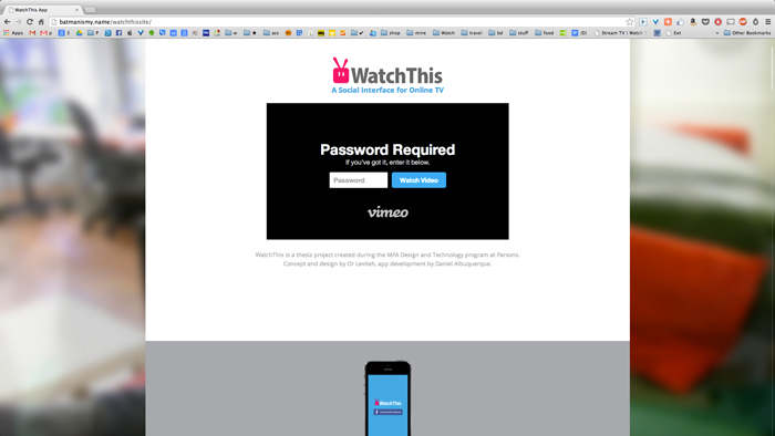
May 15, 2014
The project is done and you can check it out here: www.WatchThisApp.com.
I would like to thank everyone that helped with the making of WatchThis:
My Mom, Jeannette, Veronica, Michael, Fei, Sarah, Kamilla, Matt, Shira, Martin, Mike, Kunal, Jamie, Ted, Barbara, John and Colleen.
A special thank you to my BTSE (Best Thesis Section Ever) and BTTSE (Bestest Thesis Section Ever) for their support.
I could not have done any of this without the love, support and coding of my amazing boyfriend Dan, who built the working prototype from scratch.
Last Steps
May 11, 2014
As I was writing this, the last version of the video was rendering out. Next step would be finalizing the website for the product.
Editing Editing Editing
May 3, 2014

I felt video was a powerful means to convey a concept, in terms of look and feel. I did my best to fulfill my vision and used Adobe After Effects to bring the digital interaction to life.
Since I had planned to use the video as my symposium presentation, it had to be limited to four minutes. In order to accomplish that, I had to cut a scene out. I decide that the “Background noise” feature was the least important.

App update:
Most of the screens have been already viable and the user database functional. Both me and Dan were using the app and updating our info in order to test its usability.
I decided to reframe the project since it had become more about the social aspect. I changed the tagline to “A Social Interface for Online TV”, placing the interaction with friends in the center of the service. I knew this was the most interesting and exciting part of the service and so it deserved the honor.
Shooting weekend
April 28, 2014

I got newly found respect for cinematographers. Even though I had experienced every aspect of filming days on many occasions before, this was the first time for me to fill all the roles by myself. The shoot went on schedule and I had prime material to work with.
Video Storyboard
April 18, 2014

Next I made a rough storyboard for the video.
I tried to focus on the features that were voted most cool, and to show the general use cases of the service.
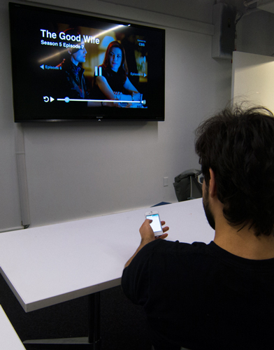
The video narratives: The main protagonist is Dan, who at the beginning is watching TV alone. The opening scene explains how the service connects to chromecast and presents the serving options. After Dan starts watching, the screen splits and Jeannette is seen on the left. Dan and Jeannette are watching the same show. Captions explain that Dan is watching at the present while Jeannette watched a week before. She posts a comment and it pops up on Dan’s phone (the purpose here was to explain the “live comment” feature). Dan then posts a comment of his own and keeps watching.
At a different location, Jeannette is looking through her facebook timeline on her phone. She sees Dan’s recently posted comment and goes through it into WatchThis app. From there she shows a few of the social features- the friends' timeline “Watching Now” and a friend’s profile page.
Moving on, Fei is seen putting on a show as “Background Noise” (here I wanted to show how the user can cast a show and still multitask on the phone). Fei sits down to check her emails, when a blue top bar appears to indicate the casting of WatchThis. Through this bar she can return to the app easily.
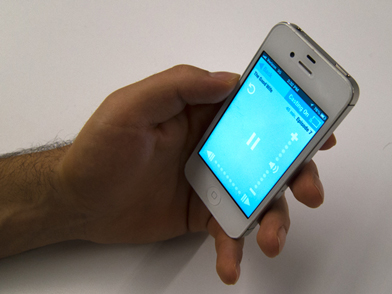
Next scene shows Shira and Martin sitting on the couch. They pick out a show from their joint list and play it. Here I wanted to show how the phone is used as a remote: Martin asks to skip the title sequence of the show, so Shira presses forward on the phone interface and the whole video including the music (Happy - By Pharrell Williams) fasts forwards until the titles are over.
The last scene presents a feature that brings joint watching to the front - “WatchThis together”. A group of friends are sitting on the couch with Dan. He opens the app and adds their names to the Watchthis Together section. The service then shows him what options they can all watch together: shows in which they are all synced, fillers that they have in common and new shows that they might all like.
Previous to that I had reserved a camera and the shooting had to take place on the weekend of the 25-27 of April. This gave me a definite deadline of completing all the design and wires I needed.
After much discussion I decided to leave the TV preview feature behind. This proved to be very difficult in terms of tech and besides, I felt that the concept of the product was strong enough without it. Consequently, for this version the users had to look at options on their phone and only the videos could be casted on the TV. I considered it a great feature, but had to give it up for that time. However, I thought it worthy of being mentioned in my presentation as a future endeavor.
Prototype update:
The app was connected to TVRage API, pulling all the info (four thousand shows total) into the app setup. The serving options have been functional already and Dan started working on creating a user database. Creating every nook and cranny of the app meant that I had to deal with many design problems of which I had not thought yet.
Cool Features
April 1, 2014

Next step of the process was figuring out how to present my concept the best way. I chose to create a video that depicted a sample of user flows and had to be short and exciting as to entice the viewers to explore the product further. Having lost my objectivity long before, I decided to get my peers’ help in deciding what were the coolest features to be incorporated in the video. I created a simple check mark paper forms and handed them out in class. I then went over the list of proposed features, explaining each quickly and with the help of a visual presentation. My peers marked the ones they regarded as the coolest. I then collected all the forms and tallied the score which marked the following winners: See what your friends are watching, “real time” comments + hidden comments, See who is following a show, and joint watchlists.
In addition to the video I wanted to present a prototype. I’ve been working on a web app version of the app for quite some time. At that point I had much of the front end ready and was on the way to create a static database in order to populate it and create an illustration of the concept. This was when Dan came in. Wishing to make my thesis concept real and to learn more about API’s, Dan took up the challenge. Dan was both an MFADT alumni and my boyfriend, which made the collaboration with him very easy. As I went on to do what I loved, which was designing, Dan worked on the back end of the app.
Midterm presentation & next steps
March 13, 2014
On March 13 I had the opportunity to show my mid-term presentation - my project as it
is today. I presented the latest progress into digital wires, using a keynote prototype. I gave a brief background, explained the need for the product and showed the main features and interactions of the service.
Critic feedback:
Both Emily Wengert and Nick Fortugno remarked that the most innovative and interesting part of the service was the social aspect.
Emily focused on how the app was successful in mimicking a real time watching experience by using the pop up comments. She suggested that this could be pushed further, maybe by incorporating voice recordings and instantaneous messaging.
Nick discussed the fact that we can no longer have a conversation about current shows because we no longer watch at the same time, and referred to the fear of spoilers. He also talked about the need to know what your friends were watching and have that lead the experience, watch what your friends are watching, binge your way up to where they are. Nick suggested that the service’s main purpose could be to coordinate social watching.
Colleen, Emily and Nick all agreed that the tagging and categorizing aspect of the service are a little overbearing and could be subsided.
In another subject, Emily noted that the entry level language is a little difficult. I could ease new users into the service and add advance features gradually.
She also stated that a lot of effort was required of the user in order to set up the service for the initial use. I will take this remark into account and see how I can simplify the process.
Next steps:
I will attempt to put more emphasis on the social aspect of the service and simplify the overall use. I plan to create a few more paper prototypes in order to explore more directions before I finalize the digital version.
Next I will have to decide what will be the extent of the final prototype. Deciding on one of a few options I currently consider depends on my timetable/the time I've got left.
Figuring out the main serving options
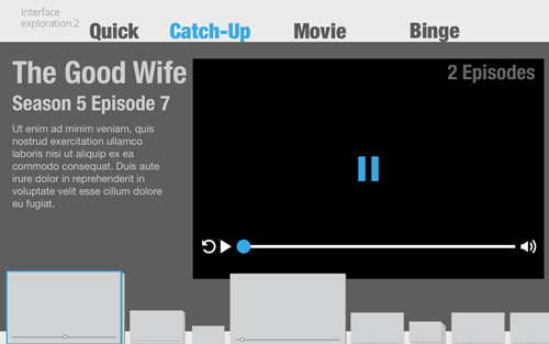
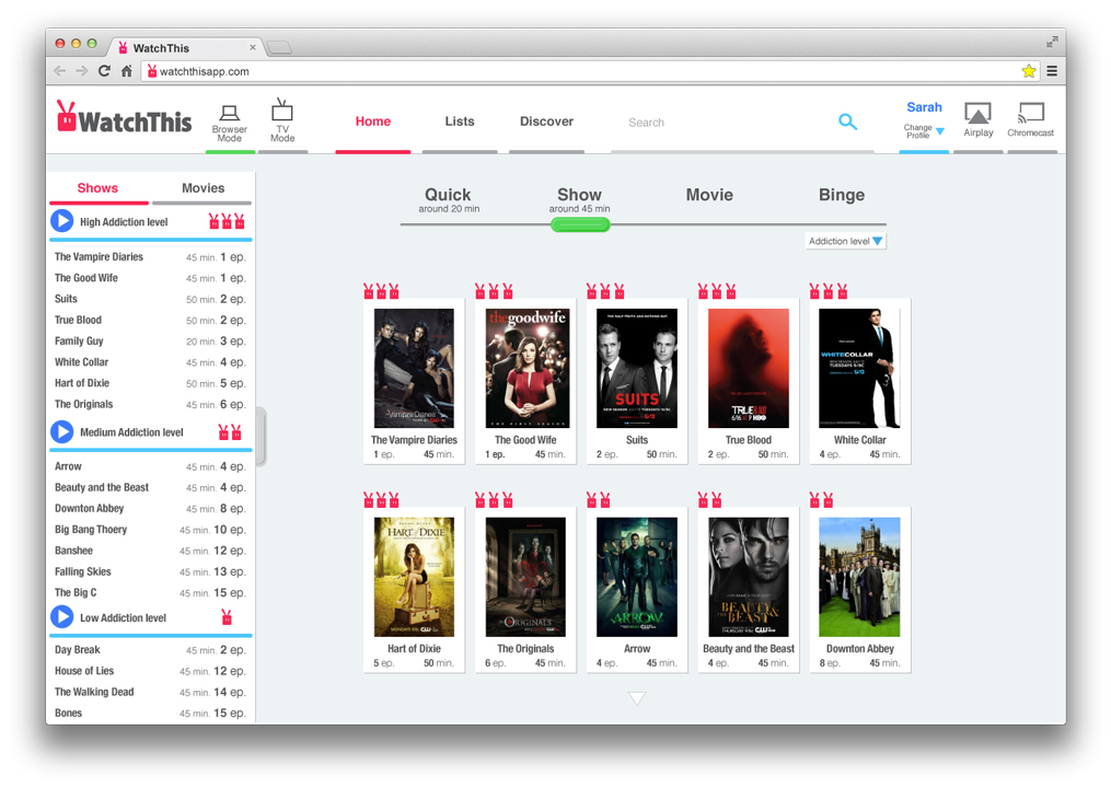
March 3, 2014

Click for full view
When opening the app, the viewer is invited to choose from a selection of serving options. These provide shortcuts to content, organized by the type of viewing experience that the user prefers. From the beginning of the project, I have been talking to viewers in order to try to understand how they watch television and how they choose what to watch next. Early on I came to four main experiences: Quick, Binge, Movie and Catch Up.
Conducting my tests in the past few weeks I’ve noticed that watching experience is very individualistic. I decided to try to come up with as many serving options as I can and test them in order to understand which would actually be used by what viewers. I organized the options in order from most used to least used, as I saw it. I had about 15 testers mark in blue all the serving options they would use and in red or pink the top three serving options they would use the most.
The results were very interesting as there were no clear winners. From this I concluded that what the viewers really need is an adaptive service that allows them to pick and organize their own serving options. In this way, every viewer can use only the serving options that would be useful to him/her.
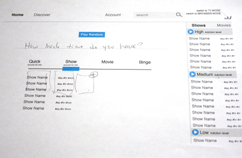
Status Update and new paper wires
Feb 17, 2014

Click for full view
I presented a status update on Tuesday, February 11. In it I went over the main features and interactions.
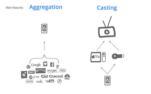
Two main features:
• Aggregation of services
• Casting via Chromecast or AppleTV
Three main interactions:
• Watch
• Organize
• Share and Discover
(See Feb 3 entry for details)
I then asked for help with two problematic terms for features in my service: “Addiction level” and “Catch-up” / ”New”. As I’ve discussed before, the word addiction stirs negative connotations. The term “Craving” was brought up as a replacement and was received warmly by the class. I integrated the new term in the wires that I will test on Tuesday. As the second term still proved problematic, for the next testing I decided to use a very (hopefully) clear phrase: “Your new episodes”. My intent was to make sure that the viewers know that these episodes are newly available and are of shows they have been following. I will test these assumptions on Tuesday.

In the status presentation, I spoke of the feedback from the first round of tests of the consumption user flow (casting on and off) and explained my next steps. Since, I was able to further explore the user flow and wire the rest of the service, taking into account the feedback from the last testing. The testing wires for Tuesday now include the whole mobile user flow when casting is off: the main screen with serving options, the menu, TV shows watchlist, the social feed and a show page.
I hope that the testing on Tuesday will help me identify pain points in the user flow that I can solve before designing the interaction via casting, which is the next step.
I was also encouraged to work on a short mission statement for the project. The first draft of it is currently on the main page of the blog.
In terms of the technical aspect, I showed the Googlecast SDK which I was inspecting. Since then I managed to get a basic application to talk to Chromecast and I will continue to explore in this direction.
Consumption user flow, paper wires
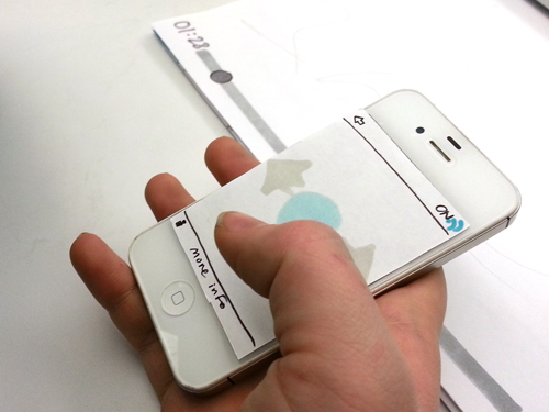
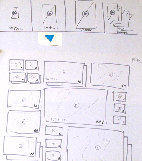
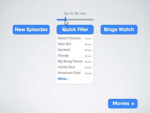
Feb 9, 2014
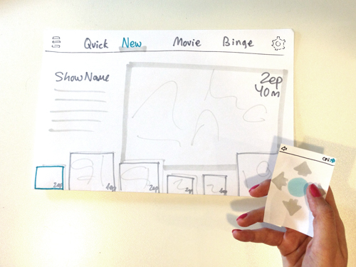
Now that I know what will be my app's main structure and functionality, I can start to consider what the main flow of interaction will be. I prepared basic paper wireframes in order to understand and test the "Consumption" part of the interaction: both the state in which the casting is on and when it is off. I tested the main flow with about 6 testers.
I am currently serving watching options by using four sections:
•Quick: Available episodes of short shows you are following or episodes you want to watch again.
•New: Newly available episodes of shows you are following - high addiction.
•Movie: Movies you have added to your watchlist and want to watch.
•Binge: Shows you are following and have more than 5 episodes available to you.
The testers expressed difficulty with the term "New" and the term "Addiction level". "New" proved to be confusing and was thought to mean new shows for the viewer to check out, as opposed to new episodes from shows they already follow.
According to two testers, the term "Addiction" has a negative connotation to it and hints to a guilty feeling accompanying the experience. I need to think these terms further and find better and clearer solutions.
Some testers failed to understand that the service is already offering them personalized information that is curated according to their preferences. This is hard to convey in a preliminary test, so next time I will try to go through a little bit of the app's setup of the app with the testers, and give them the feeling that the app is now personalized to their needs.
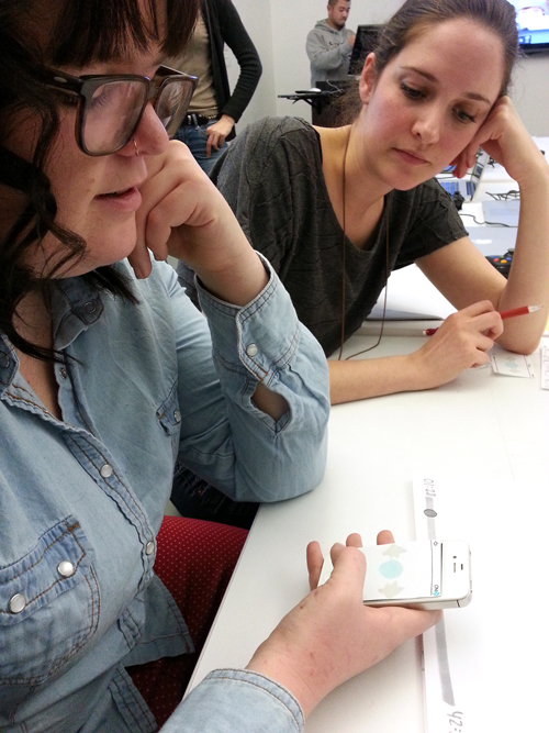
Most testers did not notice the casting icon - they engaged with it only when it was pointed out to them. Hence I assume that the icon was not prominent enough. Once the casting started, the notion of using the phone as a remote seemed to be accepted immediately.
While testing the iPhone as a remote for the casted TV interface, I let the testers have control and tried to not steer them in any specific direction. I wished to see what would be their intuitive gestures. I also enquired all testers about the actions they would perform during a watching session. They pointed out these actions and gestures:
•Hit pause/play - tap once in the middle, tap twice in the middle.
Turn volume up and down - swipe up and down, use volume keys on side of the device.
•Move forward and backward within the video - grab the marker on the timeline, swipe left or right to scrub.
•Go back 10-30 seconds - hit the designated button, swipe left to scrub.
•Mute other applications, go to other applications. In this case I suggested to have the app still open at the top of the interface across all apps, for quick return and video controls.
Two testers who wanted to share a certain part of a video, suggested taking a snapshot of the visuals. I feel this can be accomplished by adding a bookmark feature that will allow sharing of a scene or segment from the video via social networks, linking back to the service (hence, not breaking copyright laws or spoiling plot twists).
Tech Update
In terms of the technical side, I have been currently looking into prototyping using Chromecast. Google has recently opened their doors to developers and they are now offering a chromecast SDK (Software Development Kit). I now begin to understand the process and am trying to get the sample code to work on my own device. I hope to be able soon to test the phone as a remote control by using the Chormecast API.
I will give this route a week, hoping it pans out. If not, I shall look into remote control apps that connect smartphones and computers and services along those lines in order to mock up a responsive interface.
In terms of the service design, I can now start to compile a clearer list of features for each section of the app and to create preliminary paper prototypes.
Main features, main interactions
Feb 3, 2014
When presenting the concept for my thesis, I am usually faced with this question: What about the rights? You can’t take content from Netflix and HBO.
Well, I have to make this clear now and in the future: I will only provide free content from official sources and paid content to those paying for it. So there will be access to all the free content in the free tier of Hulu, and to all the available episodes on CBS and NBC. If you have a Netflix and HBOgo account, you will get that their contents as well. The videos will also be branded so that the user will know which service is providing which content.
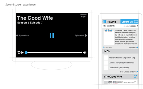
The next step for my project is trying to understand what the service will be - what are the features and what are the devices? My current idea is to have the service be casting based, meaning that a mobile device will cast the content to the television via Chromecast or AirPlay. Once the mobile device is connected to the television and is in casting mode, the mobile device turns into a remote control and the main interaction happens on the big screen. The mobile device will also supply second screen interactions while playing the video such as displaying IMDb information and relevant twitter feeds.
If this is the case, I will have to address two states in the interface: The mobile device while not connected, and both the mobile device and the television interface while connected.
In terms of features, the 2 main features and benefits of the service are:
The service will collect all the content and information in one place, making it easy for viewers to search through options, see what is available and watch videos from one place.
Casting
The service will allow the viewers to cast the content to the television and watch their videos on the big screen.
The three main interactions with the services are:
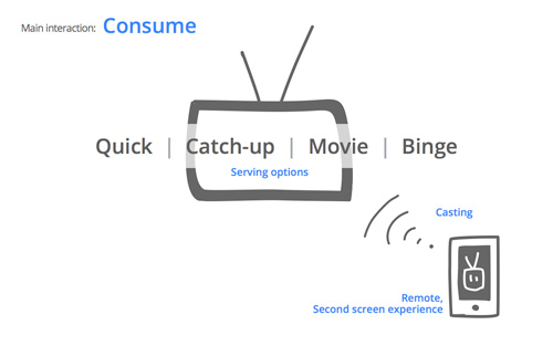
The service will serve the viewer with options on what kind of watching experience they want, offering either a “Quick watch”, “Catch up”, “Movie” or “Binge watch”.
The mobile device will cast the content to the television and be used as a remote and as a second screen experience.
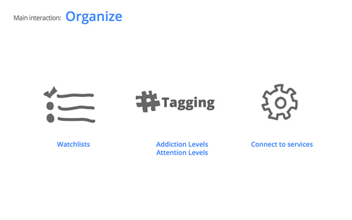
Organize
The service will help the viewers keep track of what they wished to watch, both movies and TV shows, and keep track of which episode they are on.
A tagging system will make it easy for the viewers to get the exact content they want right now, using personalized craving levels and attention levels for each show.
The service will allow an easy way to connect to all services in one place and help the viewers discover and join new ones.
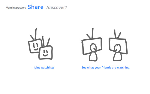
Share /discover?
The joint watchlists will help viewers watch together by automatically generating lists of the common items of all viewers. Couples or friends watching shows together will also find it easy to keep track of joint shows.
The service will allow the viewer to know what friends/others are watching and this way to discover new content.
Prototype 7: Digital mobile prototype.
Peer review at MFADT
I had the privilege to present the current state of my thesis to a group of eager first years and so to test out my seventh prototype. I wanted to use this opportunity to explore the scope of the product and decide on the platforms for which I wished to design.
I wanted to test a version of the product that will consist only of a mobile app which would cast to a television screen, which means beginning the interaction by using the smartphone and being presented with all the information on said platform. Once casting to the television via Chromecast or Airplay, all the information is then presented on the big screen. At that point the phone becomes a controller.
In this iteration I created a simple prototype for a smartphone controller for the video playback screen in order to determine if the mobile+casting option is viable. The most relevant feedback I got was that of the viewers' wish to keep using their smartphones while watching, a datum which asserted my initial assumption. I need to make clear for future iterations that once the casting is on, the viewer can still interact with the service simultaneously with using other applications.
One other point that was raised dealt with the abundance of shows on the interface. Continuing with the project, I will take into account more types of users and design for both the power viewer who follows 30 shows and the occasional viewer who only watches a handful. I want to make sure that the interaction works well for both.
Prototype 6: Digital freestanding user flow wires.
First semester final presentation
In this iteration I wanted to convey clearly the conclusions I got to by testing prototypes 4 and 5. I came up with a list of exciting and important features that I knew I wanted to include in the product, and presented them through short use cases. In addition I presented two versions of interfaces that I developed from prototype 5: a web interface and a TV interface.
The features include:
• First time use and sign up, discover and search for content, get service recommendations, add new content, setup settings for each item.
• Social interaction through the service, see what your friends are watching and get recommendations, share, create easy collaborative watchlists that are automatically populated by joint content.
• TV and browser modes, difference in size, color and dynamics of control.
• Second screen experience, get access to information that is useful while watching; like IMDb, twitter feed and options to share.
The exploration of the web version consisted with an interface version in which there are differently sized items to show the level of personal addiction, stacked to signify the quantity, and organised by time. The items are separated by the type of experience the user is looking for: Quick, Catch Up, Movie and Binge. Each item has its own video player, already showing the title sequence or recap scenes.
The TV version was centered around a full screen video player that plays on entry to the service. The transition between items is linear, allowing for a quick and easy interaction with any controller and device.
Click here for all prototype images.
I feel that at this point I need to decide what scope I will go for in terms of my thesis project. I need to decide how many versions to make and how many platforms I want to design for. This will change the way I approach the design and which route I will take: bowser vs. 10 foot experience, mobile vs. desktop, game consoles or smart TV app.
I am currently exploring the idea of having a mobile app that casts to a television only. This way the experience is being limited to the mobile platform and the TV screen.
I intend to create a few rapid prototypes and test them out during the next week.
Updates are yet to come!
Prototype 5: Paper wires.
Rethinking the boring interface, December
The goal of this iteration was to try to leave the confinements of the ordinary media selection interfaces, like those we see on Netflix/Hulu/Amazon. I wished to go beyond the grid of static movie posters and TV show images. I started by trying to rearrange the content on the page, and also the additional information about each program. I decided to explore the idea of signifying multiple episodes from the same show with a digital stack of items. I also tried to show the addiction levels as different sizes. I tried different information presentations for different controllers.
One idea I came to is utilizing the advantages of the online platform by displaying all the content as dynamic video. In this case, instead of showing a static image, each show would be signified by a video of the title sequence of the show, and/or scenes from the last episode watched. My hope is that this will entice the viewers to watch the next episode.
Click here for all wires.
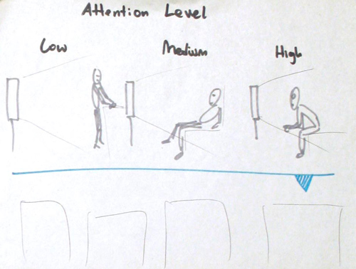
Another observation I made and wanted to incorporate is the level of attention required from the viewers for each show. This difference between a high, medium and low attention, could help in the tagging and selection process of the viewers.
Tech Prototype 1: Parsing through a database.
Direct link: bit.ly/onlinetvtechpro1
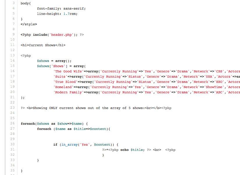
I created a simple test site that can parse through a list of shows, and fish out just the current ones. I tried to practice dealing with databases and dynamic data. The next stage would be working with the GuideBox API and managing to parse through their live database.
Prototype 4: Digital, interactive prototype online.
Direct link: bit.ly/onlinetvpro1

In this iteration I worked off of the wires from the previous prototype and started to explore how the viewers would flow through the interface. This made some gaps in the flow very apparent, so that I completed those while converting the prototype into an interactive one.
In this version I first addressed the issue of browser mode vs. TV mode. I realized that I needed to take into account the type of controllers used by the viewers and their distances from the screen. I wanted to give the viewers a chance to change the interface, when needed, for an easier interaction. The TV mode would present larger Content which is easy to see from far away ( “The 10 foot experience”) and the interface will allow for easy interaction with only a mouse.
One popular demand during feedback was to drastically change TV mode so that it will be very different from the browser mode.
Through testing I came to the conclusion that I had to take into account other controllers, like a TV remote and game controllers. I tried to keep this in mind when I designed a few options for the additional information for each show. I intended to steer clear of the common “hover” option in order to make the interface approachable by different controllers.
Another main concern that was raised was the amount of information on the screen and the lack of hierarchy. The term “Show” also proved to be ambiguous and I agreed that it could benefit from some more clarity.
This prototype was a great opportunity for testing my initial ideas and figuring out which features I would like to include in the final product. I came to the conclusion that the main interaction with the product is too familiar and too close to what we have now. I decided to put this iteration aside and start from scratch with some brand new and hopefully different concepts for interacting with a list of TV content online.
Prototype 4B: Visual design snapshot, digital.
First take on visual design, November
I played around with a few visual styles for the service and finally created one take. My goal was to keep the interface clean, while making sure that the different states of the functions were very easy to quickly understand.
In testing, this version proved to be too cluttered, presenting too much information with no hierarchy. Some concern was raised about too much use of white, and again the lack of drastic change between TV mode and browser mode was expressed. I learned that I can not shy away from the norm of using a black background for the TV mode, given the great demand among testers.
Prototype 3: Digital wires, fully flushed.
Figuring out the main structure
Click here for all wires.
The main goal of this iteration was to understand the structure of the service in its current form - a desktop website. I divided the service into a few sections:
• The landing page / main page would display available-for-watching episodes from shows that the user is following.
• The Discover page would allow the user to browse through more content, add it to lists or just play it.
• The account page is where the user would add services and change settings.
I explored the option of having four different content parsers on the main page: Quick (a show around 20 min), Show (around 45 min), Movie and Binge. I introduced a slider interface that allows the viewers to quickly switch from one option to the next without feeling that the page is reloading. I explored a few different interfaces for the main page.
Upon testing I decided to go with a more visually enticing interface for the content: big images for each show. From this point I went on to test out this iteration by building an interactive prototype.
Prototype 2: Digital, free standing wires.
Figuring out the main features
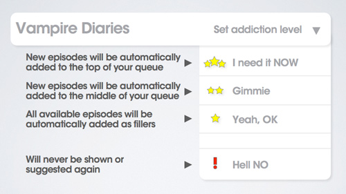
In this iteration, I transitioned into the digital space and presented snapshots of the interaction. The main interaction with the content was through this initial division: New Episodes, Quick Filler, Binge Watch and Movies. Each section also presented its own time selection, so that the duration of watching could be adjusted according to personal preferences. Each title would open a drop down menu with the list of available items. I also showed the ‘first time use’ and account setup, the settings available for each show and the site structure, and I introduced the “Addiction Level”. I wanted to have a gauge which the viewers could set in order to indicate how much they liked a show. I played around with the concept of addiction levels: High would be: “I need it now”, Medium would be “Gimmie” and low would be “Yeah OK”. I also added a “Hell No” option for disliked contents. These different levels of addiction would play into the order of the content within the queue: high addiction on top, and low on the bottom. I concluded from the testing that the phrase “addiction” might be a bit problematic. I have yet to find a better term for this purpose.
Click here for all wires.
The goal of this prototype is to show the viability of the concept and to present the main features and difference of interface. From here I went on to show the features within the context by flushing out the main structure of the entire site. I've also got to think further about the place of movies in our watching habits, as it should not be separated from shows.
Prototype 1: Paper wires.
Walking through the concept, October
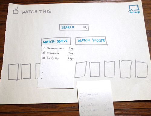
In order to be able to talk through my thought process, I made an initial paper prototype exploring the different features I had in mind.
I started off by expressing my plan to create a personalized service, so that any content the user sees on the interface is the user's own; your watchlist and TV shows followed.
I also wanted to explain the process of connecting to outside services like Netflix and Hulu, information applications like IMDb, and social networks.
Other features I presented were:
• Personal stats for each user, including time watched, number of shows followed and more.
• A social stream showing matching actions of the user's friends.
• Joint watchlists for friends, couples and families.
My main exploration for prototype 1 was to consider how the main page interaction will work. I attempted a few methods of information organization and tried to come up with a new experience for watching online television.

The conclusion indicated that the most interesting direction was organizing content by types of experience. I initially tried these: Quick Watch, Movie Night, Guilty Pleasure and Binge Watch. I also arrived at the idea of having a “filler list”: offering shows to be watched when nothing else is available. Now it was time to focus on exploring the main interaction and so that the other parts of the service would soon fall into place.